CSS Grid Tutorial


How to create CSS Grid
We first set the display property to the grid.
Then we defined our grid using the grid template row property.
Same thing for columns and then we set grid gap for rows and columns.
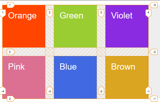
In firefox, we got a nice view of the grid by just clicking grid on the dev tools and then adding the line number here.

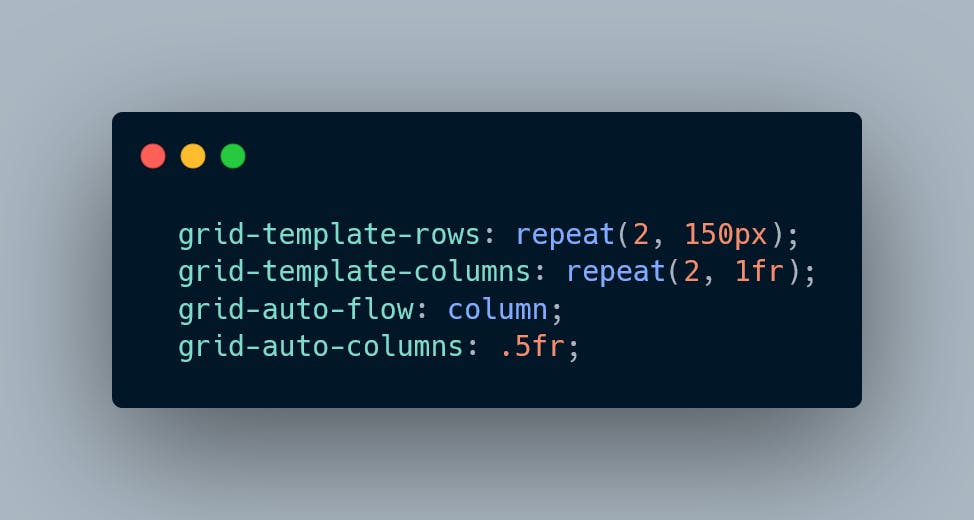
Here grid-template-rows have two tracks of 150px each
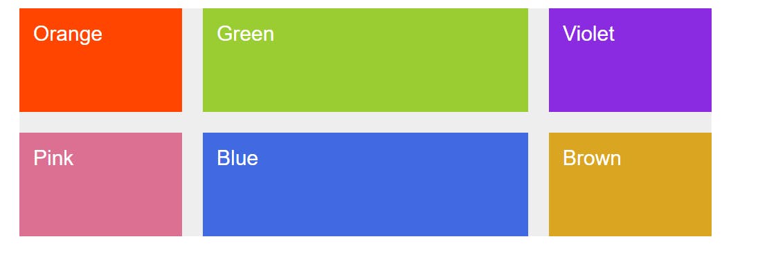
We can use further grid repeat function to make our life easy.


Here fr is a fraction of available space.
We can create three equal columns easily.
Or we can increase size of one column easily.

We can also use percentage unit in grids

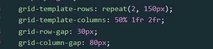
Here first one got 50% of the template width, and the middle one get narrower due to the column gap and got 1fr space left after the deduction grid column gap value.

View Code on
See the Pen Creating our First Grid Revised by Mujtaba Abid (@mujju88) on CodePen.
Positioning Grid Items
Grid items can be positioned easily by using choosing getting correct column and row values. Thanks to Firefox we can easily finds the grid line value by clicking on display grid there.

Now we can see the numbers of grid tracks here.


The properties used for positioning grid items are row or column start and end property.
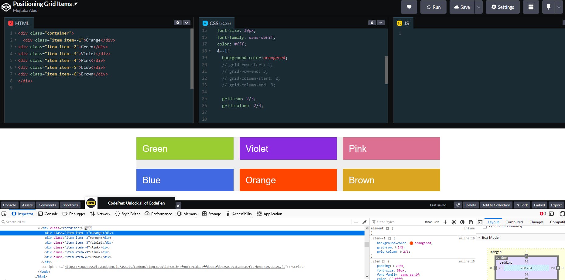
Positioning a first grid item on the second row and second column.
See the Pen Positioning Grid Items by Mujtaba Abid (@mujju88) on CodePen.
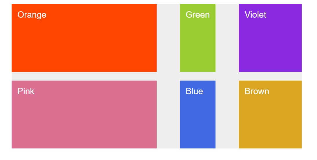
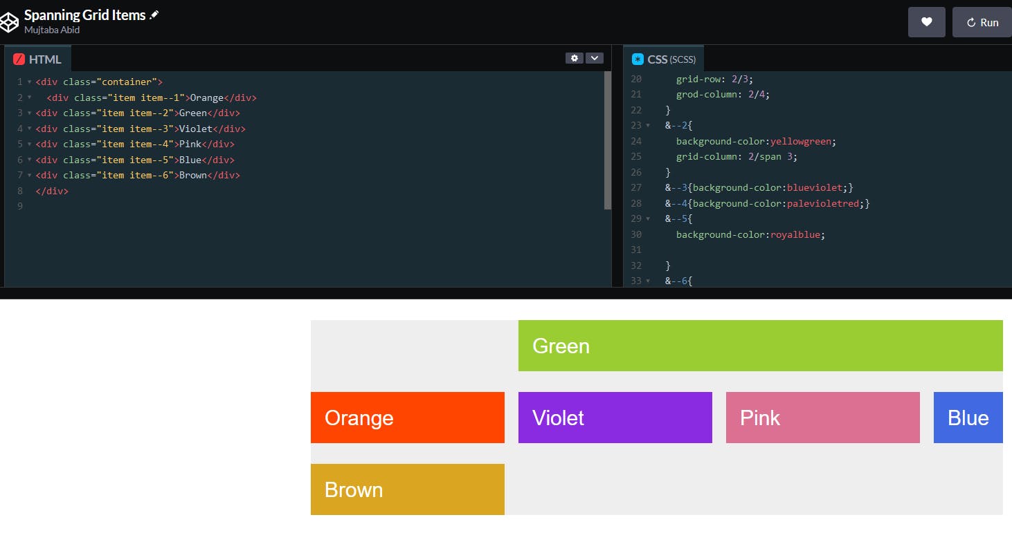
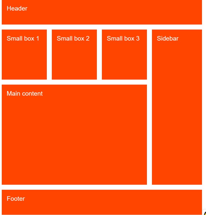
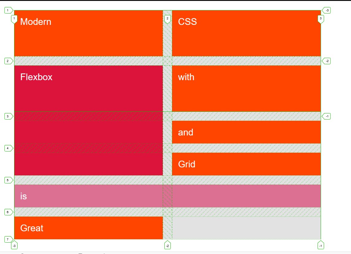
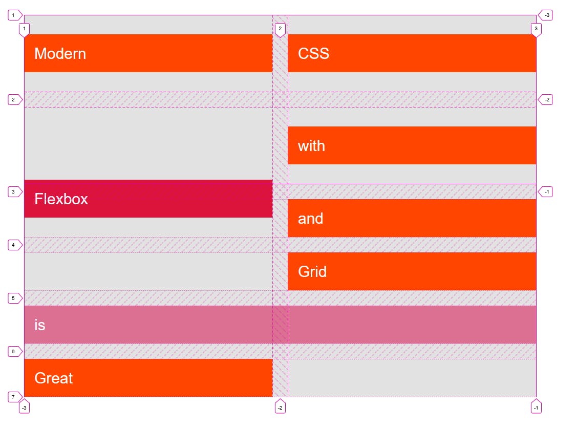
Spanning Grid Items
Multiple grid items can occupy same cells.
If the grid item finds a value that is impossible to adjust it will add new row or column;
This happens due to implicit grid.

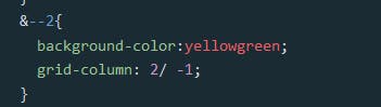
For example, we don't know how many columns are there. If we want our grid item to move to the end of the column. We can use the -1 to represent the end.
For spannig we basically use three different ways.
We simply defined end number of the row or column.
Second, we use the span keyword.
Third, we simply use minus one so it occupy all the cells until the end.
Tips: It works for rows and columns here.
See the Pen Grid Challenge by Mujtaba Abid (@mujju88) on CodePen.
Naming Grid Lines
Instead of writing rows and column numbers, you can easily write names for these tracks. For example, these can be names like header or col etc.
Let's see an example below.

See the Pen Untitled by Mujtaba Abid (@mujju88) on CodePen.
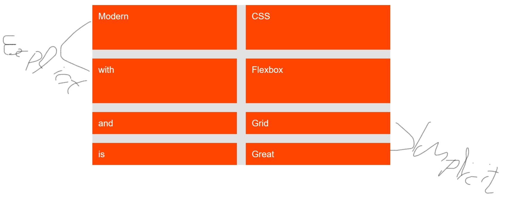
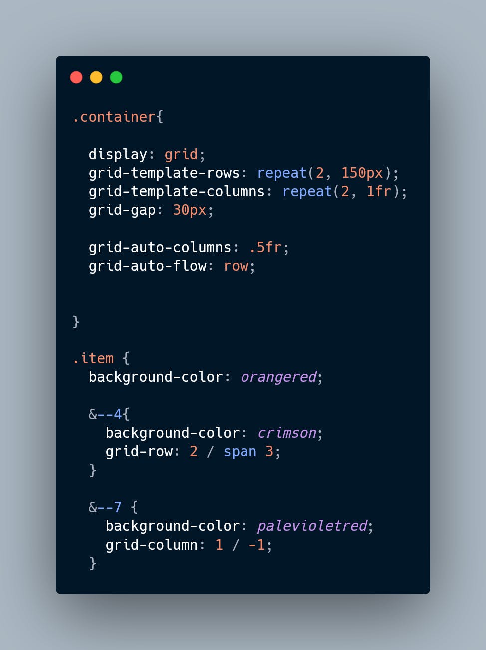
Implicit Grid vs Explicit Grid
Explicit Grid is the grid that was actually defined in our code.
The part that was automatically added to fill the content is known as implicit grid.
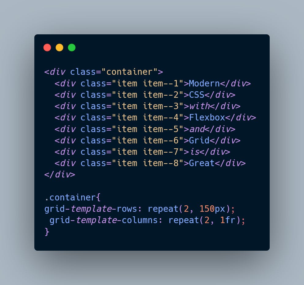
We can style the implicit grid by using grid-auto-rows property.
These explicit grids are now added as rows. But we can also style it as column.

See the Pen Implicit Grids vs Explicit Grids by Mujtaba Abid (@mujju88) on CodePen.
Aligning Grid Items
Without aligning the grid items the item occupy all the available space.
In some cases we can use align item property to align the item in available space vertically.
// align-items: center;
By default align-items is set to stretch.
We can use justify content to align it horzantally.

For example we use justify-item property to center.
We have align-self and justify-self property for child items.
See the Pen Aligning Grid Items by Mujtaba Abid (@mujju88) on CodePen.
Aligning Tracks
Align item and justify items is just for indiviual items. We can set the grid container by using justify content and align content so that it can align the entire grid tracks.

We use dense keyword in grid auto flow to cover the empty space.
See the Pen Aligning Grid Items by Mujtaba Abid (@mujju88) on CodePen.